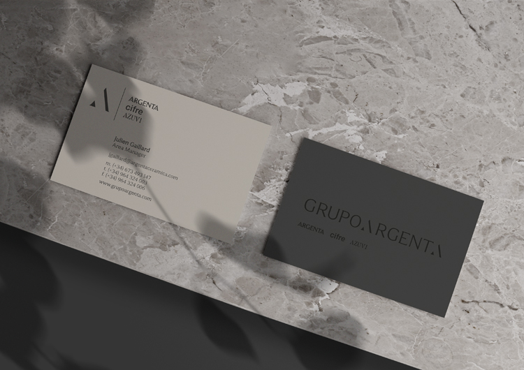
Our origin defines us. Our roots connect us with who we are and with what we transmit, forming our most personal identity. They sustain us and help us strengthen a bond with the environment that surrounds us and with the people around us.Following this concept, we believe that it is key when approaching this project to embark on a journey towards the origin and roots of the Argenta brand itself. Taking the same typographic and structural family as a base, reworking it, but keeping certain parameters fixed that will be the foundations when building this new identity. So we will avoid confusion and not lose the existing positioning and current brand recognizability.A new brand that was born with the objective of becoming the emblem that represents the business group, establishing a very clear visual hierarchy and whose corporate structure must be totally impartial, giving true prominence to the group's brands.Differentiating it from the Argenta brand and relying on the group's sub-brands, so that in an educational way it is directly associated with the three united brands of the business holding company.
client: Grupo Argenta
category: Brand Identity


